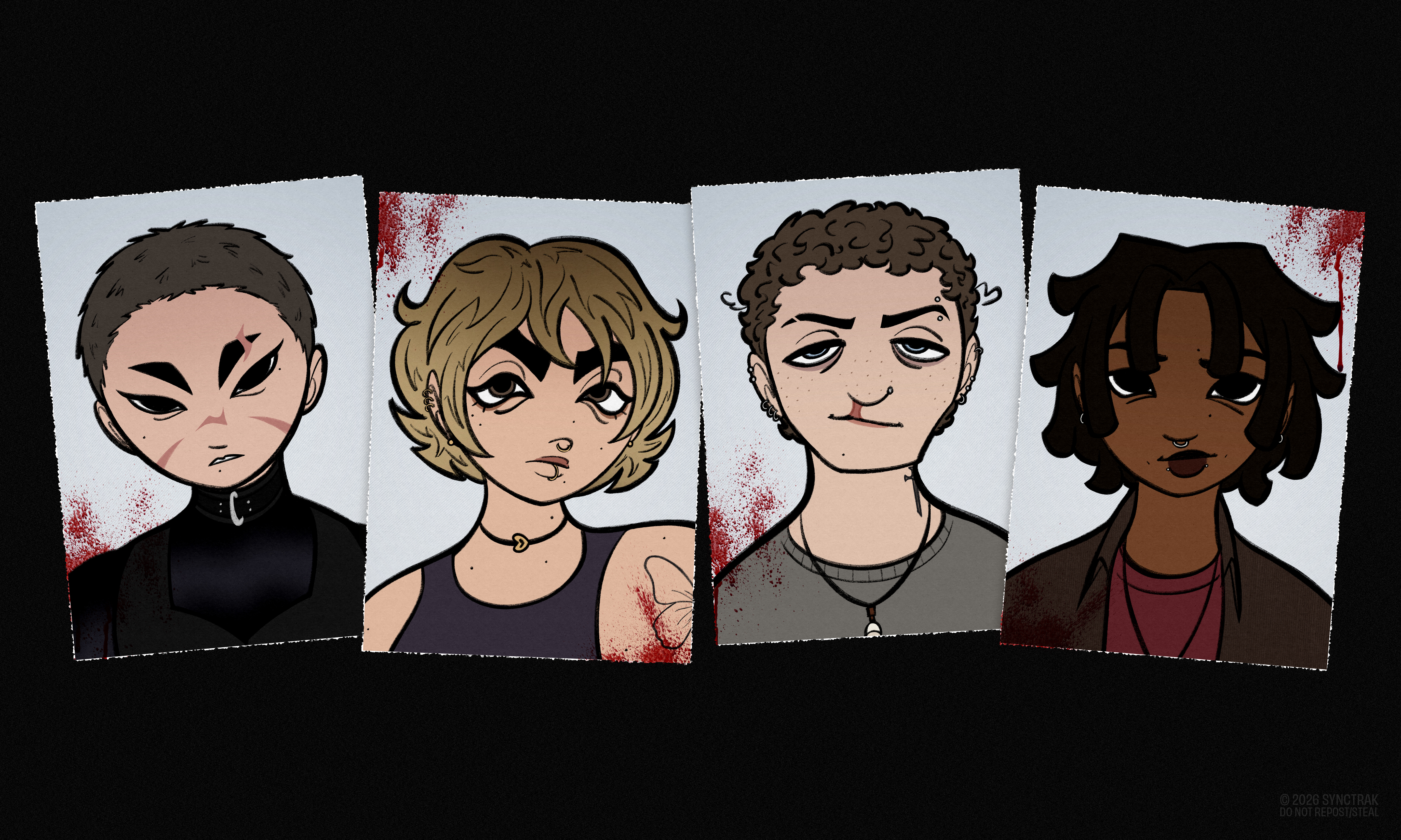
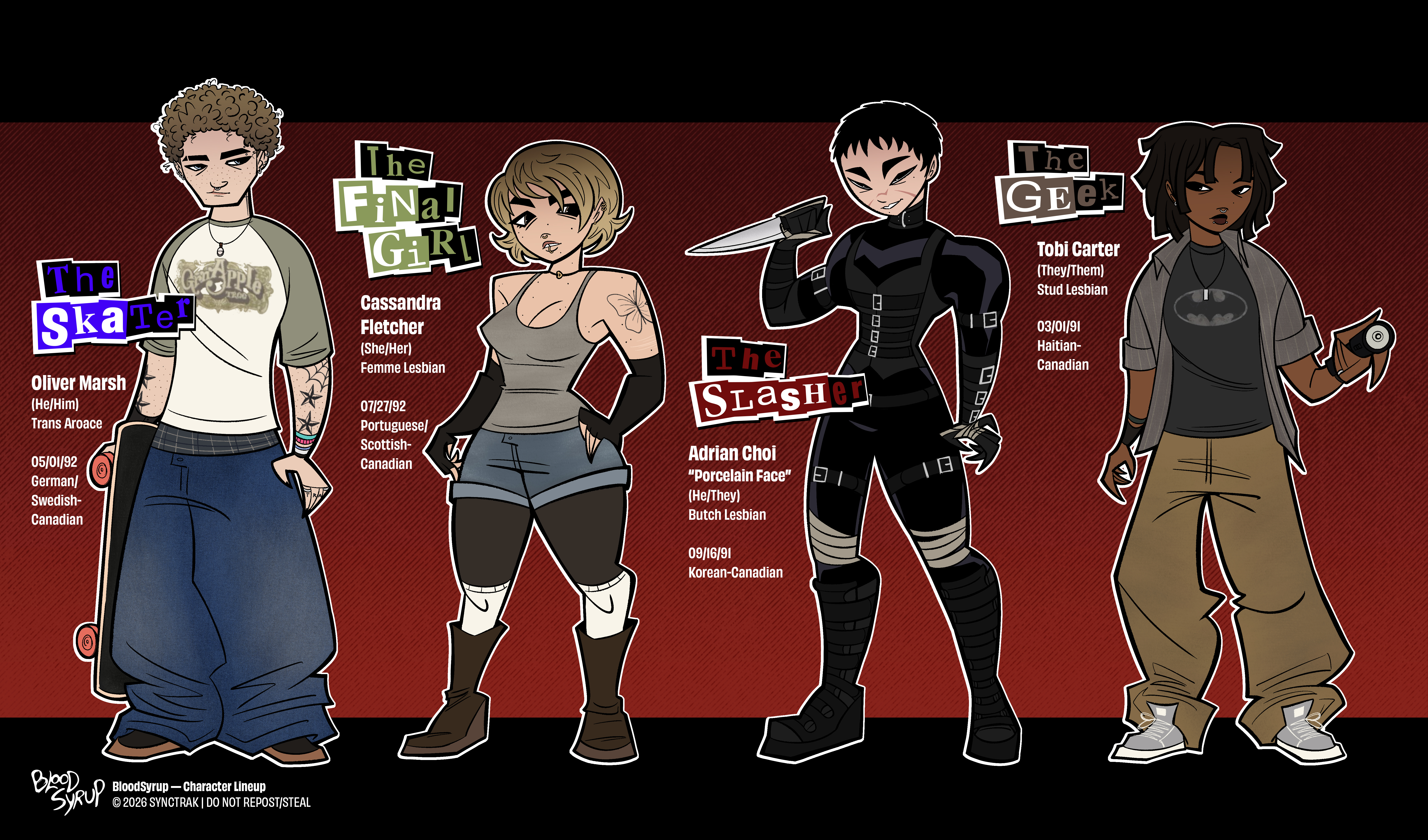
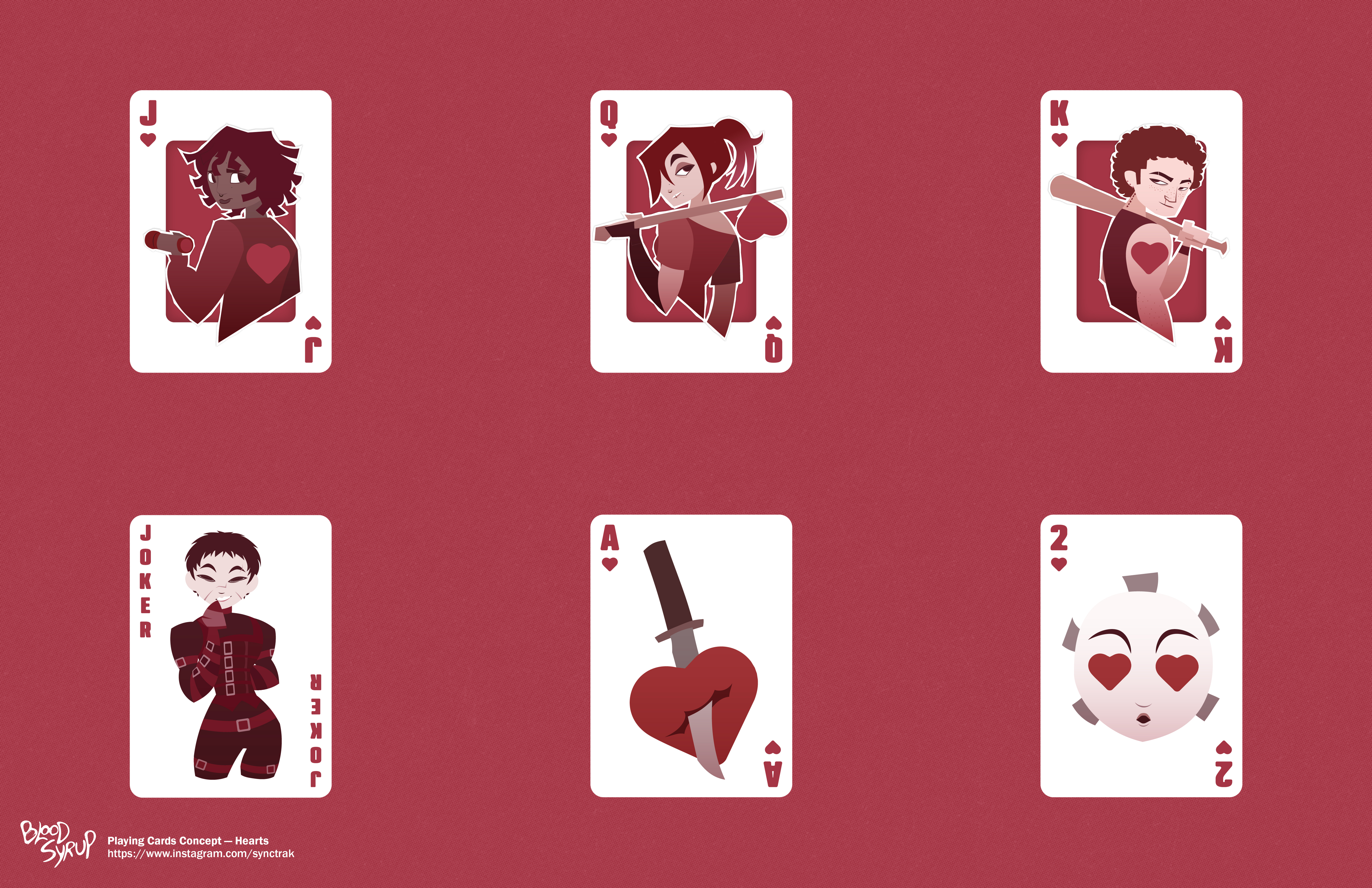
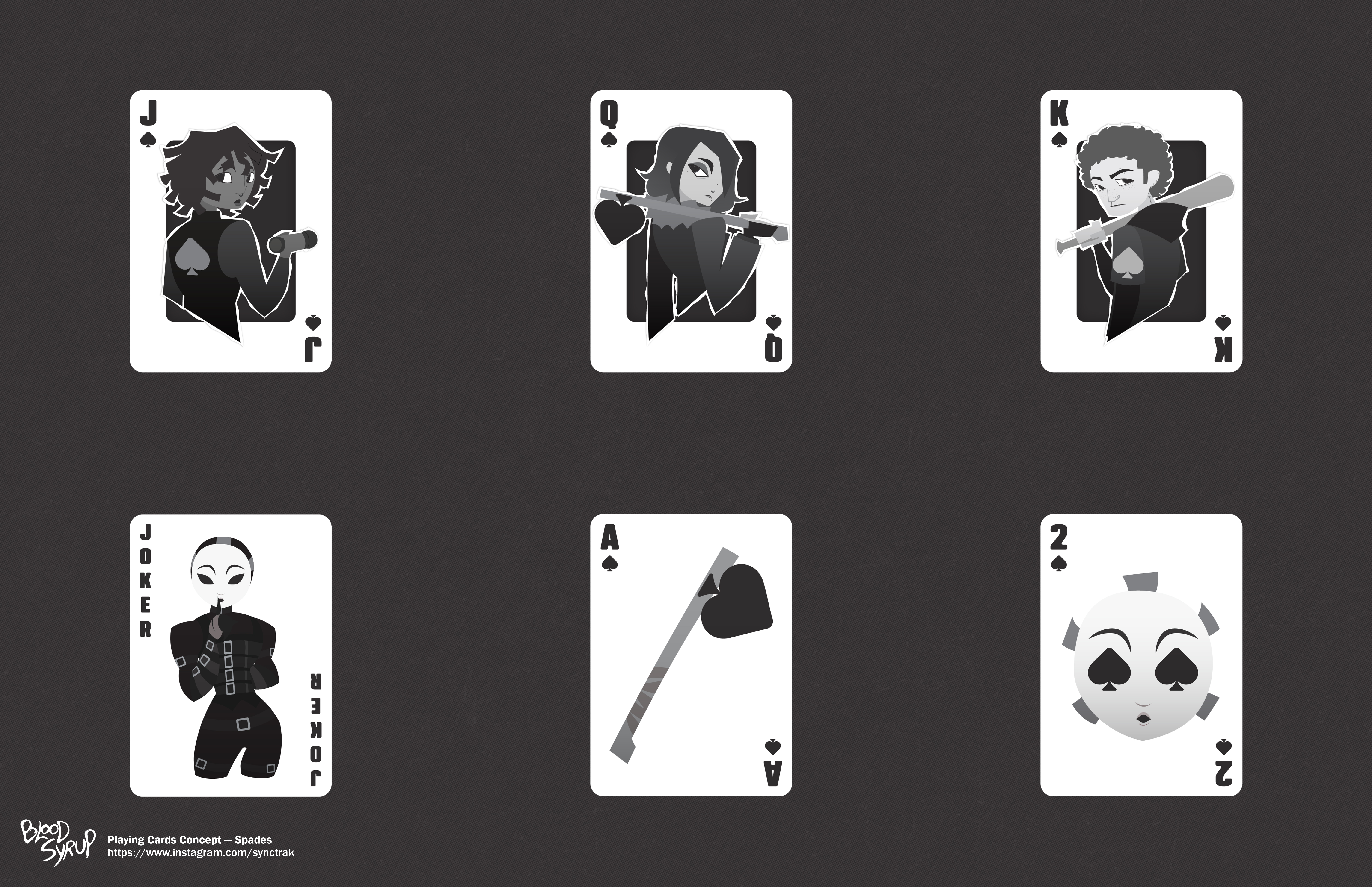
FIRST OF ALL, WHAT IS BLOOD SYRUP?
BloodSyrup is an original universe inspired by the slasher movie genre, with an interesting twist focused on GIRL LOVE (yes, Lesbian representation) and gender identity. It features an art style reminiscent of animated TV shows from the late 2000s and early 2010s.
This passion project is something I’ve been developing since 2021, growing from simple digital illustrations/character designs into something much bigger, now expanding into animation and beyond.
Using the applications Procreate and Photoshop, I am able to bring my vision onto various media, with the goal of eventually green lighting an actual animated series!
THE (INITIAL) IDEA
A bunch of inspirations for BloodSyrup came to life from the love of intriguing character designs and the yearning of nostalgia. Being inspired by iconic masked slashers like Ghostface, I thought it would be exciting to create a character of my own (…and their tragic backstories).
Some characters are also inspired by my favorite fictional characters and musicians, whose influence helps shape the original creations entirely. But most importantly, some elements are tied to nostalgia and growing up in Canada around the 2010s, which is the time period the story is set in.
The ARTSTYLE LOOKS FAMILIAR…
As mentioned before, I wanted to emulate the nostalgic look of animated Canadian TV shows you can find airing on Teletoon or YTV …so technically, it could be sort of a Total Drama/6teen/Clone High hybrid in terms of the style.
I went for a style that includes heavy use of shapes and minimal colors to keep its simplicity, while still preserving details such as the facial structure. However, some of the artstyle elements aren’t consistent as I’m still figuring out what to do creatively, but it’s always about experimenting!
Most of the illustrations use darker tones to evoke the vibes of an indie horror movie, moreso, it is a stylistic choice by me because it resembles blood (how ironic), and the upcoming dangers the survivors— Cass, Oliver and Tobi— have to face with the bloodlusted serial killer Porcelain Face.
Stylized typography is also heavily used within the pieces, with each character having their own signature type style associated to their aesthetic (for example: Oliver has a grungy street style font to match bratty personality and his role as “the Skater”).
Each piece gives a chance to the viewers to be integrated in the story, as if they are experiencing the scene with the characters involved. Either way, the story is meant to be interactive and observed with whoever’s reading it.